Flags
Honolulu flag Re-Design

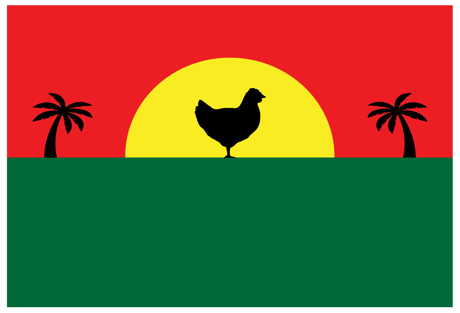
First Flag
This flag was inspired by the dominance of the chicken in on the landscape of Honolulu. I tried to incorporate the traditional colours of Hawaii into the flag, as well as trying to evoke an emotion from the viewer, specifically the all too familiar feeling of waking up at the crack of dawn to chickens screaming. The silhouette of the chicken against the sun is an unfortunate reminder to everyone residing in urban Honolulu as to whom the true master of our city is.

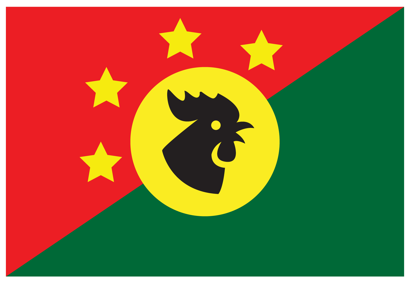
Second Flag
This second flag takes the concepts of the first one and simply moves it into a new design direction. I split the green and red colours diagonally across the flag's surface, and then used the sun as a background for the chicken's head. The four stars are indicative of the four counties of Hawai'i, with Honolulu being arguably the most important. Again, the chicken is figured prominently, being the overlord of the entire state, completely unimpeachable in it's dominance of the islands.