Crete Logo
Tourism
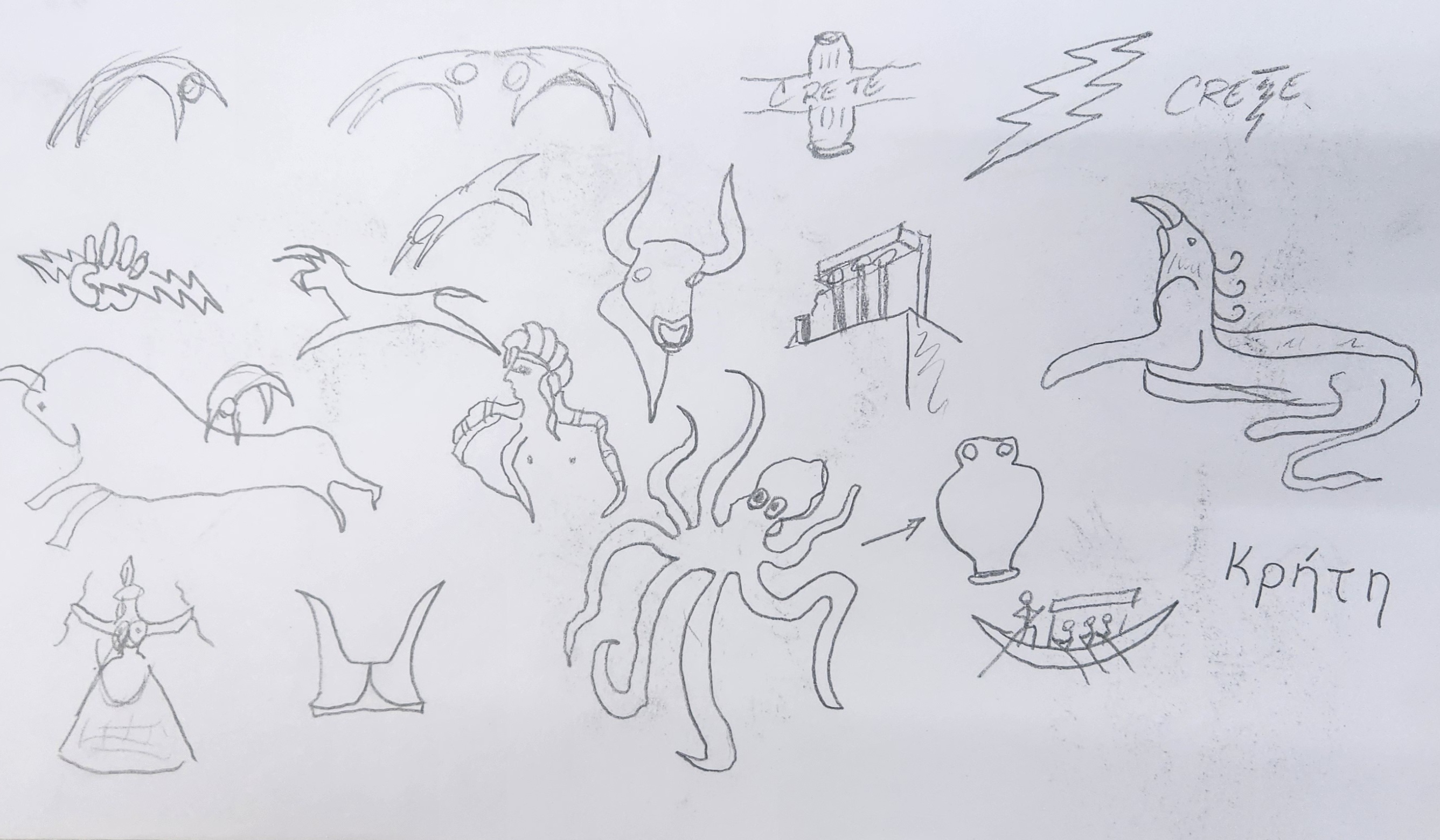
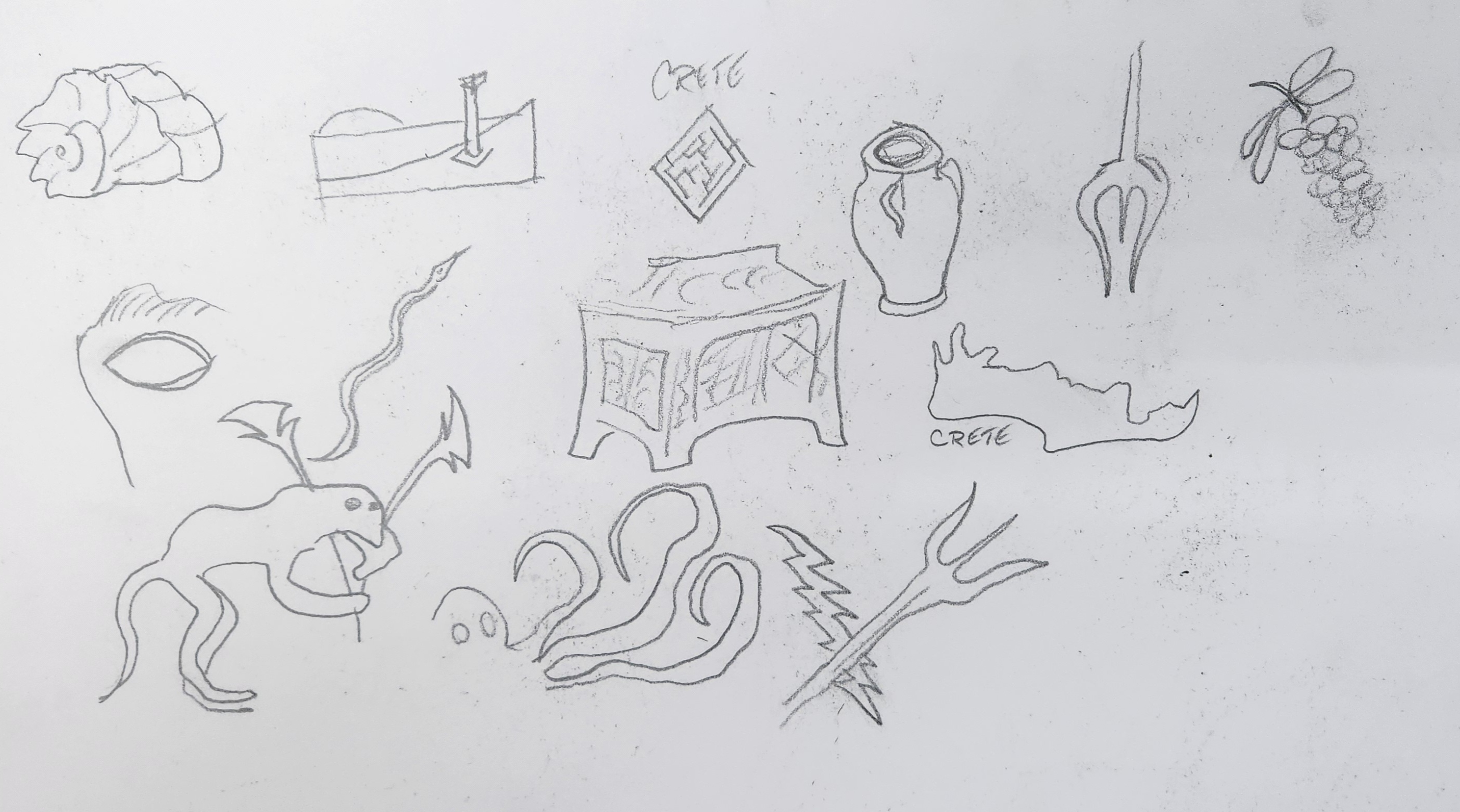
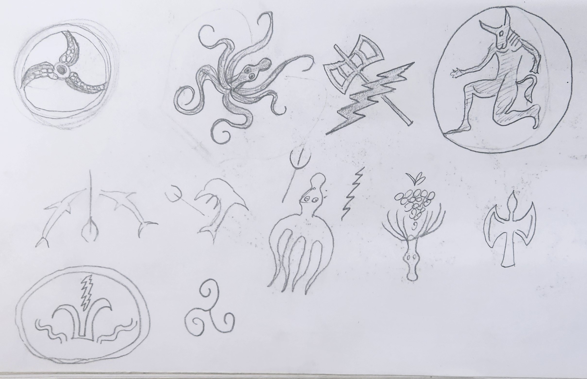
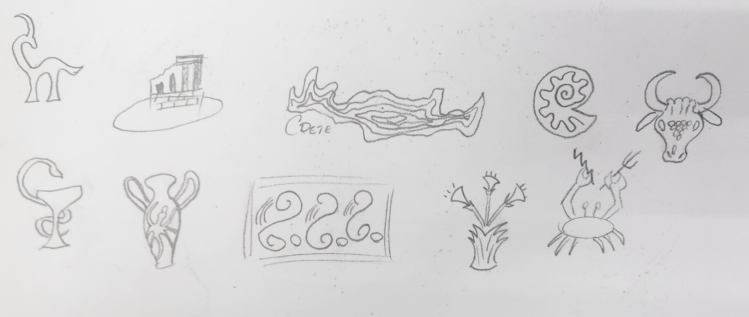
Ideation & Sketches
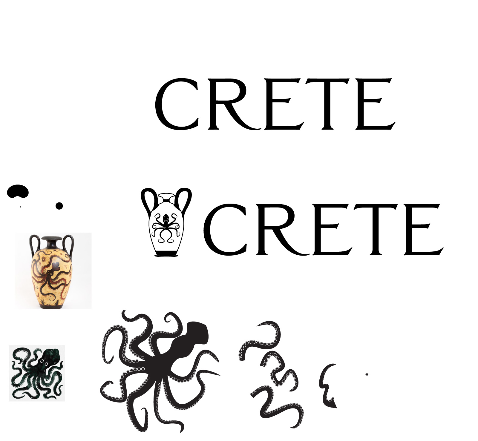
I began this project with research and sketches. I was particularly interested in the history of Crete in addition to the natural beauty of the countryside. Crete is well-known for its Minoan ruins as well as its uniquely Mediterranean climate, and I felt that the direction of my design should reflect that. With that in mind, I began sketching not only the ruins of the island, but also its topography. I also paid particular attention to symbols of mythology associated with the culutre of ancient Crete.
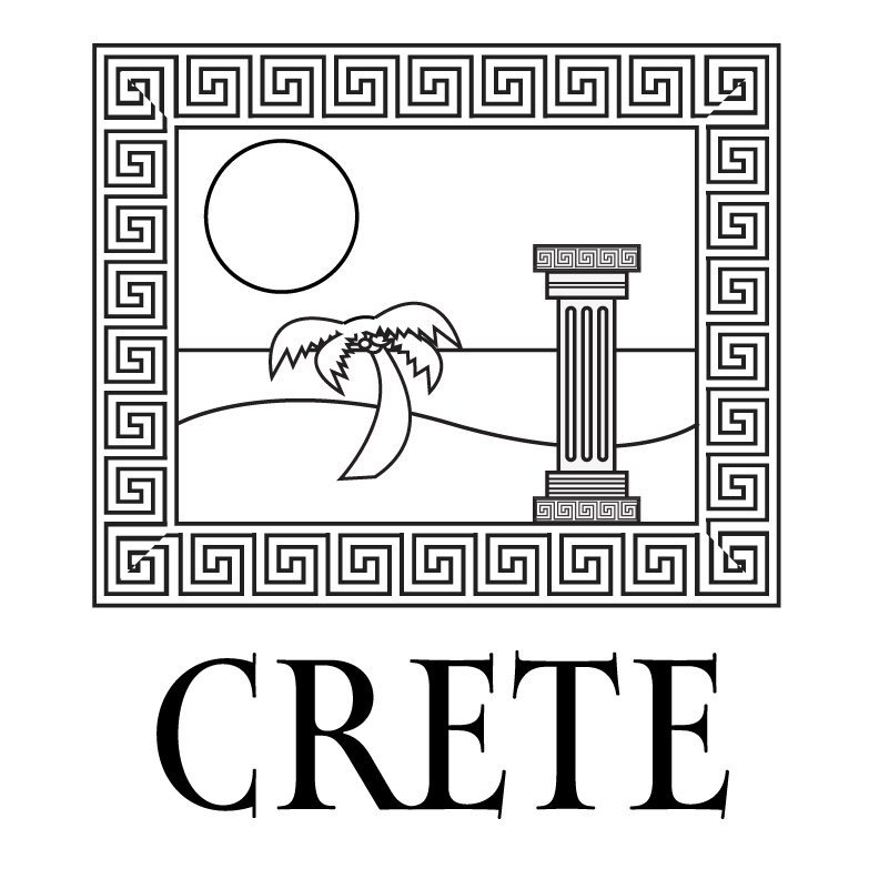
First Pass
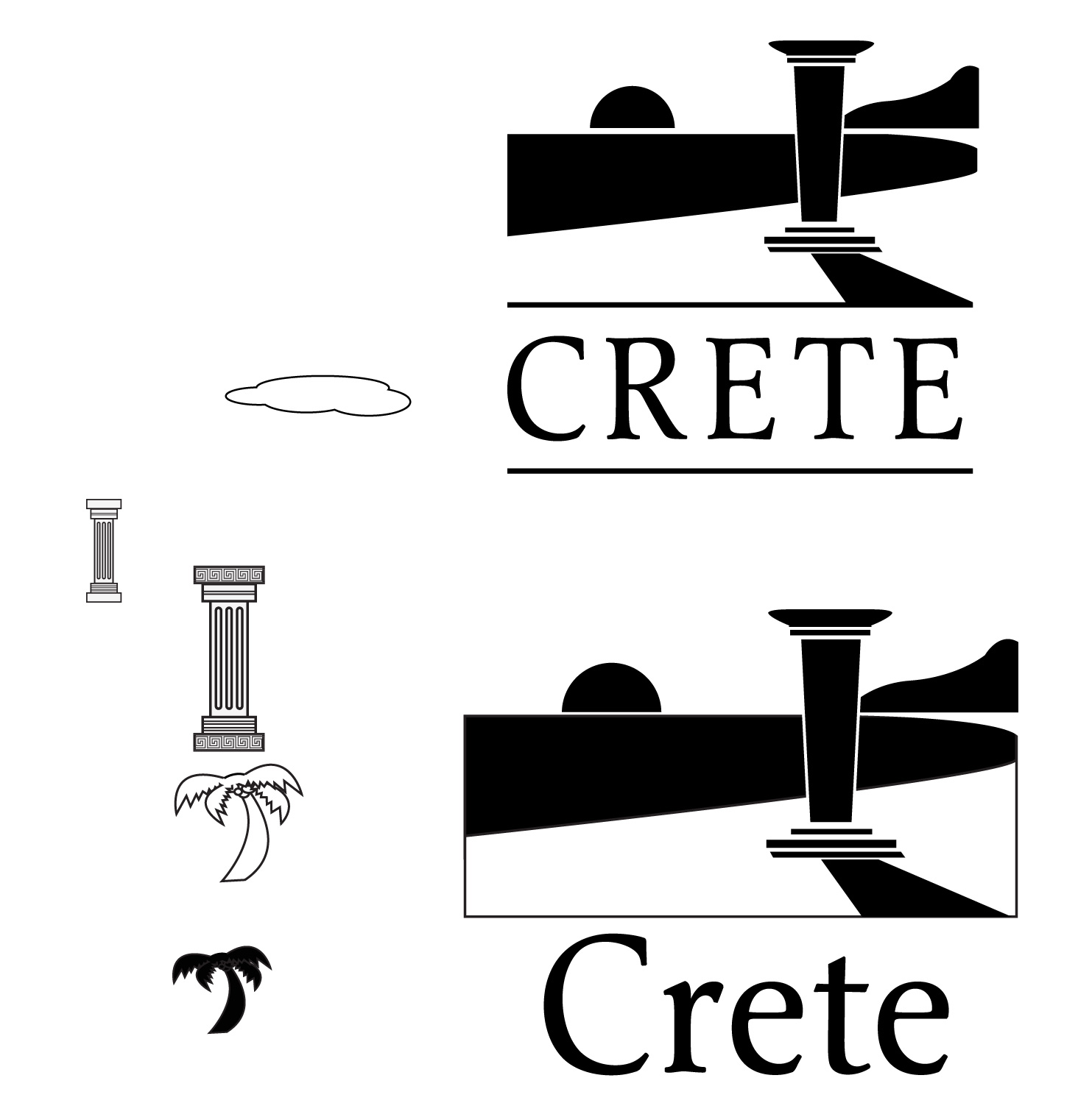
This first pass was the culmination of several sketches as well as other assets pulled from prior projects. For example, the palm tree was from an earlier illustrator project that eventually became an after effects video. Further iterations on this design would see multiple sweeping changes, although the underlying aesthetic would remain the same.
Work Progression
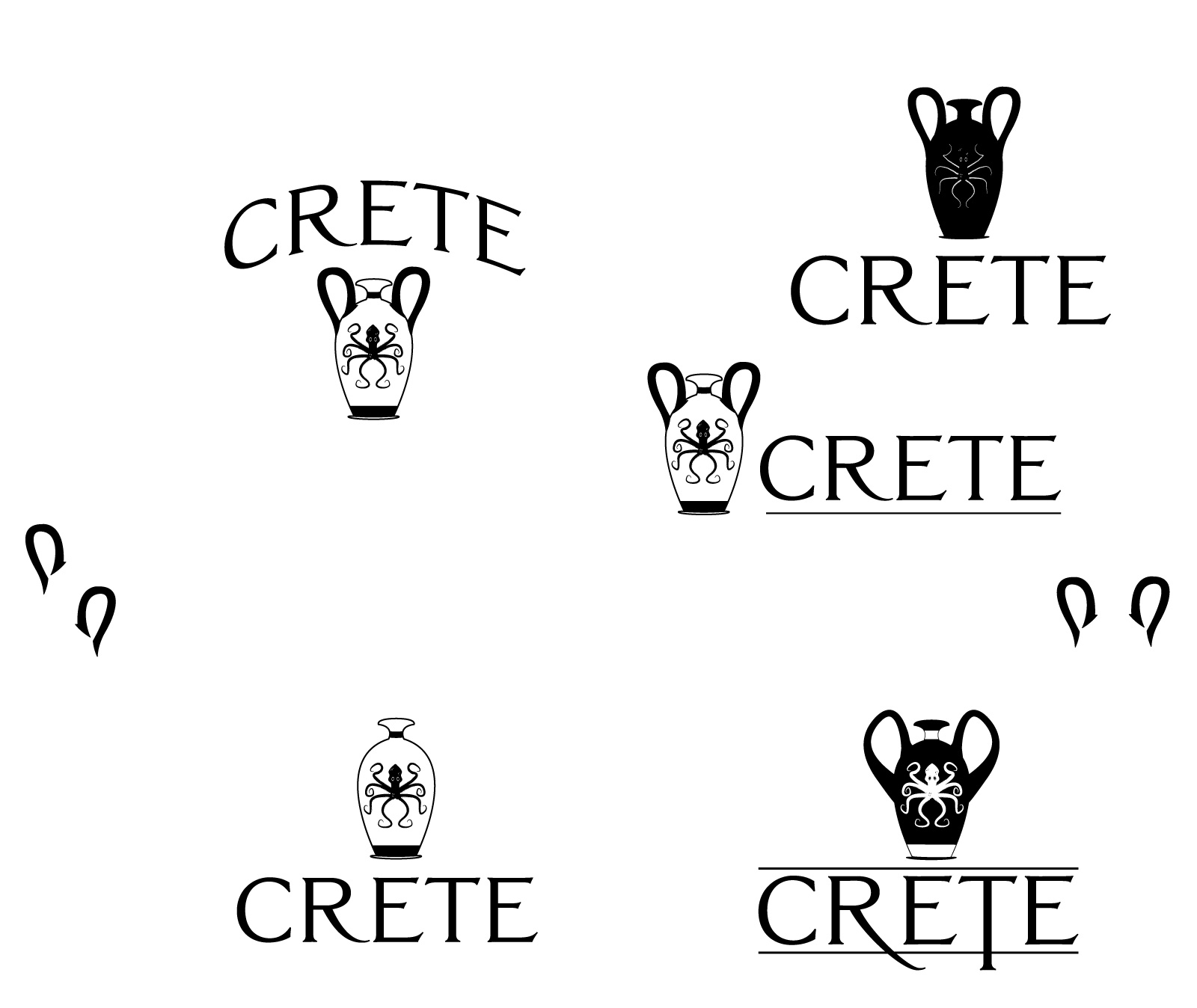
This series of images shows the progress I made from ideation and sketches after the first pass. Although the idea was to initially use beach and column, I had other ideas that I developed as well. One of the most promising was the minoan octopus, which got far into develelopment but ultimately was shelved in favour of the beach scene. I did use the logo type for Crete, replacing the original one late in the design stage.
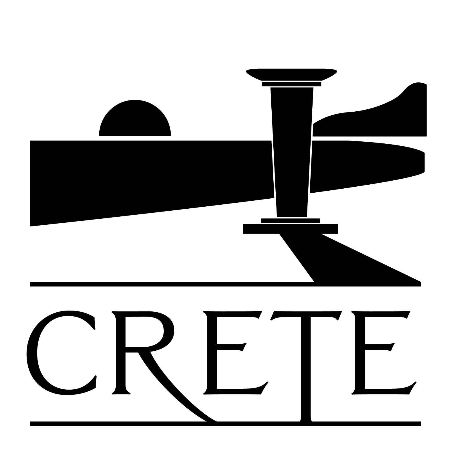
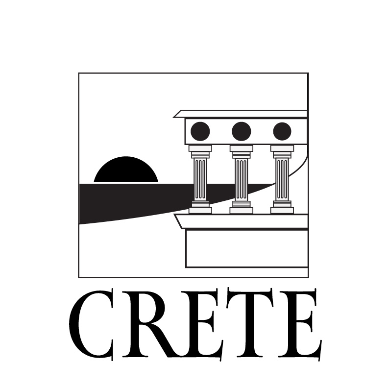
Crete Tourism Logo
This was the final design, rendered in black and white. I kept many of the original ideas, such as the beach, column, and sun. I purposely kept the idea that this could represent a sunset or sunrise vague, hoping that the interpretation could be up to the viewer. Ultimately I myself envisioned a sunset however.
One of the few design concepts I borrowed from my other works was the typography. Originally this type was used within the Minoan octopus amphora. Although this idea was eventually scrapped, the type was too good to leave behind, and I decided to incorporate it here.
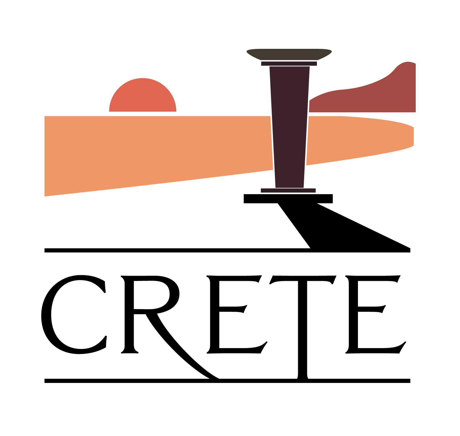
Thought Process
Although Crete is well known, I have not seen a tourist logo that I felt inspired anyone to visit it. I wanted to incorporate both the landscape and Crete’s history into one image that I felt could evoke an emotion. I wanted a simple image that would inspire a feeling of beauty, but also severity using a bold typeface that demands attention. One of the challenges was colour, as I felt that blues and greens were not evocative of the tranquility I was seeking, and opted instead to choose the colour of the setting sun against the beach and water, as well as the column.
