Magazine Spread
Albrecht Dürer

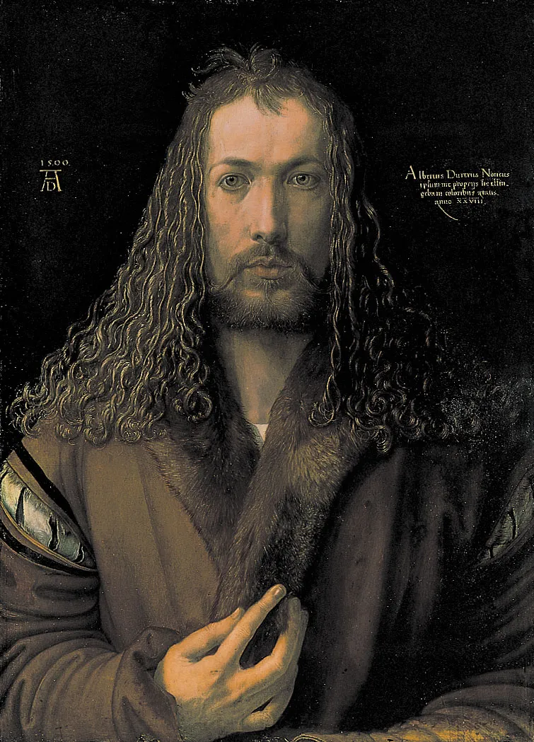
Embarking on the journey of designing a magazine layout dedicated to the illustrious artist Albrecht Dürer was both exhilarating and challenging. Dürer's contributions to art, spanning the Renaissance period, are profound and multifaceted, presenting a plethora of creative opportunities and design considerations. This project aimed to encapsulate Dürer's legacy while infusing modern design elements to captivate contemporary audiences.

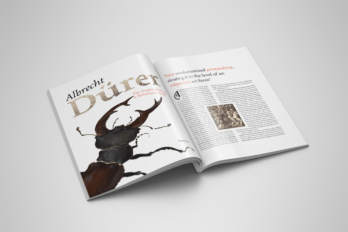
First Spread & Thoughts
This spread was conceived after mulitiple other examples of magazine spreads were completed. The previous spreads were "safe"; that is more scholarly in style, whilst the two featured on this page were envisioned to be featured in a history magazine such as "National Geographic" or another publication in that style. I chose to highlight the ant over the background, as I felt that that was the most important aspect of the picture. I used orange in the headers to draw the attention of the reader whist not being overly distracting from the images themselves. I used a stylised drop cap on the article to evoke a feeling of the time period on the reader, and inserted the illustration within the text so that the reader would not have move their eyes off the text to view it.

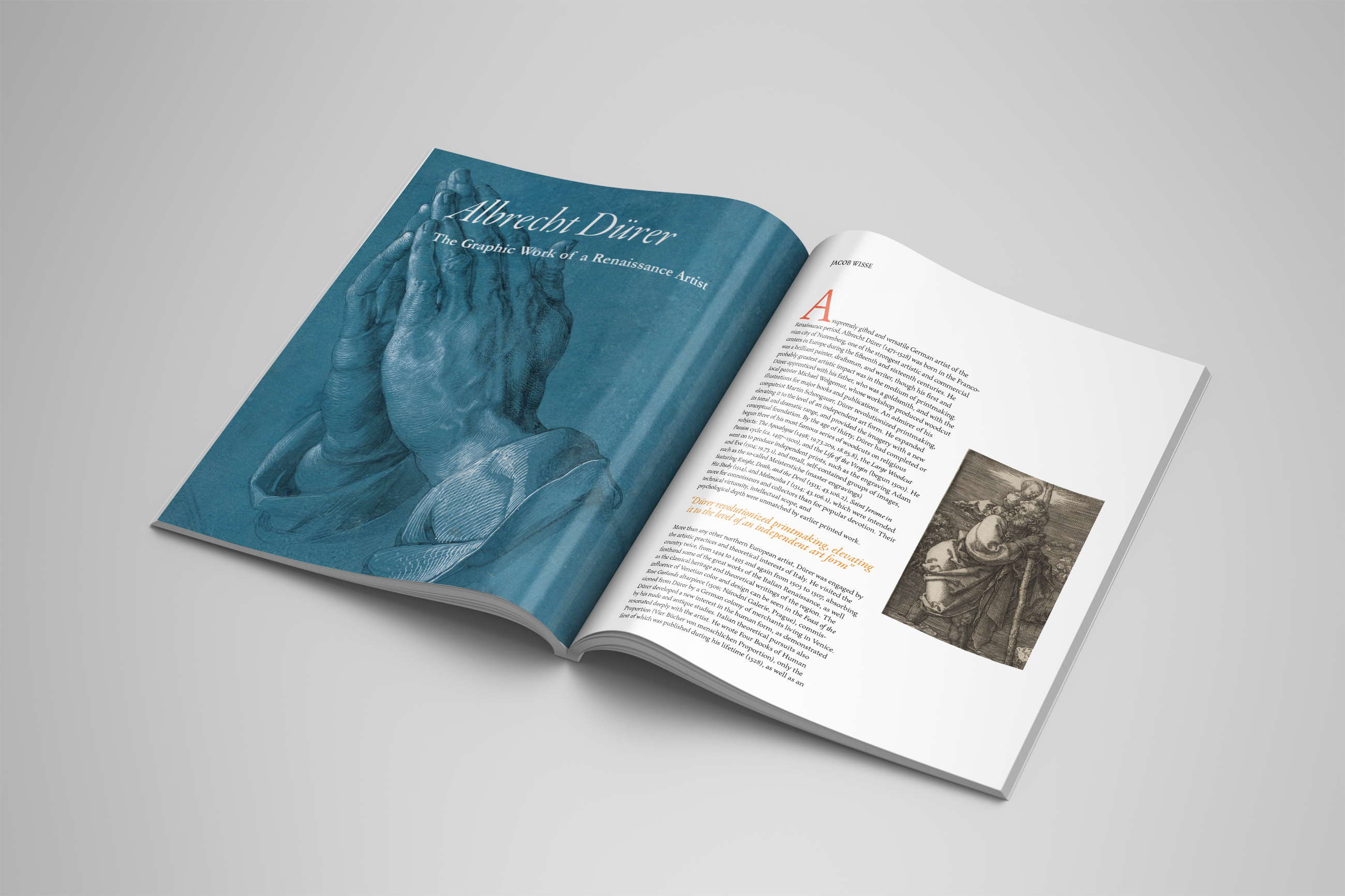
Second Spread & Thoughts
This spread is an extension of the first spread, but with larger graphics. I opted for a full page spread of the clasping hands in order to draw the reader's attention to the article. The drop cap in the body copy is much more traditional, reflecting the more scholarly and less stylised aspect of this design. Again, an orange colour was used, mainly to draw attention without being too obtrusive. This time I relegated the body copy to the left and gave almost equal space to the image on the right in order to keep white space on both the top and bottom of the page.